ANNAPOLIS ROYAL, NS - Craft beer labels have become the new canvas for artists these days as they conjure up images to go with the names, taste and colour of the latest brews or the old favourites.
None of that artwork is by accident and all of it ties in with branding that makes craft beer patrons want to hoist a few cold ones after work or on a hot day.
But most of that artwork has a connection to the local community either historically, culturally, geographically - or all three. Local craft beer, at least for the most part in the Annapolis Valley, reflects the people who drink it.
Paul St. Laurent of Annapolis Brewing Company said his beer names and the beer art that go with it are tightly connected to each other and the beer itself.
The taproom is located across from Fort Anne. Looking across St. George Street, there’s a canon with the fort in the background. That image, rendered by an artist, is the company's logo.
All ABC’s beers are named for things historic, and the labels reflect that.
“Acadian Honey Brown covers pretty much from Yarmouth up to the Valley, and a lot of our labels are named after local history,” he said. “Ceasefire after the canon at the fort, King George, we’ve got W&A Railway Rye IPA, which is the Windsor and Annapolis Railway. So there’s a connection to all of our labels and our beer names to the area. And it’s very easy to do here, being so historic. Finding a name for a beer is not a challenge.”
Lunn’s Mill
In Lawrencetown, Lunn’s Mill Beer Company taps into history, so to speak.
“The village used to be called Lunn’s Mill before it was renamed to Lawrencetown,” said Sean Ebert, part owner and brewer.
Right from the start, the company wanted to reflect the community. When it came to artwork, it has a tree in the shape of a beer bottle that's reflective of the sawmill once located in the village.
“We asked a graphic artist, who normally just does T-shirts, to put together a logo for us and he came back with two options,” said Ebert. “One was a beaver riding a log and the other one was the beer bottle. We really liked the look of the beer bottle, so we went with that.”

After a year and a half in business, the image is well-known locally and adorns hats and t-shirts, glasses and growlers. Although Lunn's Mill doesn't bottle beer, the tree shaped like a beer bottle has appeared on cans of the product.
“We didn’t want to be old-timey or anything like that. But we still wanted to have something that was a timeless kind of branding.”
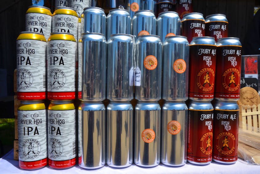
Wayfarers’ Ale Society in Port Williams has a logo of a person walking with a stick circled by the company name. It’s on all the beer cans but the lettering and colouring of the cans reflect the beer name, taste, and colour. The name and logo artwork is reflective of medieval England, where ‘wayfarers’ stopped at local churches to be given a small horn of ale and a piece of bread before they continued their travels.
Horton Ridge Malt & Grain Company has a drawing of its unique facility for its logo, a malt house where barley is germinated and then dried on the malt floor before being used to make beer. While it’s the only malt house around the Valley, historically malt houses were common, so it also ties into history.

Branding
“The impression I get is when a client, or a craft beer lover, first taste the beer, they enjoy what they’re sipping and then they revert to the label,” said St. Laurent. “The beer now goes back to the history on the label. We try and put a little bit of writing on our labels and talk about the history.”
It gets people talking and thinking, he says.
“We’ve had a lot of comments saying ‘it’s kind of cool that we’re learning a little bit about your area from your label,’” he said. “Who’s King George? You may go on Wikipedia. You may not know what Acadia is. You’re from out of town. You might google Acadia.”

Ceasefire IPA actually has a picture of the fort on the label with the canon out front of it.
“Just like we see it here from the taproom,” he said. “Blockhouse Blonde? There used to be a blockhouse here in Annapolis. Fenwick’s our lightest ale. That was named after Sir William Fenwick, who was born in Annapolis Royal and went over to England and became a renowned general and an excellent leader and came back to Nova Scotia to become Nova Scotia’s first lieutenant governor. So we’ve got Sir William Fenwick on the label holding a mug with the Nova Scotia crest on it. There’s history there.”
To get its first label, ABC held an online contest for its Windsor & Annapolis Railway Rye IPA. The person who won that contest now does all of the company's labels and St. Laurent said she nails it every time.
With the logo and label art, St. Laurent has turned it into a brand.
Work together
He said the product and the brand have to work together.
“That’s our goal and it is working. We see it,” he said.
“You go into Halifax and people will be like ‘hey I saw the Mini (company car) that’s all done up,’ or ‘your labels, I saw them at Liquid Assets,’ or ‘your stubbies look awesome.’ We get so many comments on the artwork on our stubby bottles. It’s crazy.”
He said people experience both the beer and the brand and can eventually just see the label and conjure up the taste of their go-to brew and the experience that is craft beer.
He said 90 per cent of craft beer drinkers are visual people, making label art important, especially when social media is all about pictures – like Instagram. He makes sure images of ABC brews are on Instagram every day.
And that beaver on a log at Lunn’s Mill? An iteration of that is up on the wall in the taproom.
READ MORE:
- The complete Summer Suds series
- Source your Annapolis Valley craft beer
- Crafting a new future for beer in the Annapolis Valley
- ‘It’s a labour of love’: Pioneering brewer reflects on success at Sea Level in Port Williams
- Head of the class: Ellershouse man passionate about creating the beer behind Schoolhouse Brewery
- ‘From grain to glass’: Horton Ridge Malt and Grain Company adding local flavour to the craft beer business
- From farm to bottle: Sourcing local hops a challenge for Annapolis Valley brewers
- A disadvantage in our own market’: Craft beer brewer association president says Nova Scotia brewers hit with unfair tax
- ‘The more the merrier’: Annapolis Valley brewers say craft beer appeals to those from 19 to 90 in Nova Scotia
- ‘A better beer-drinking experience’: Why these three women love Annapolis Valley craft beer
- ‘Be a little adventurous’: Man behind Lawrencetown brewery gave up career out west to follow his dreams
- From pinching pennies to tossing the PhD: Paddy’s brewmaster Kirsten MacDonald talks about her love for craft beer
- Not just taste: Unique label art, logos a big part of the craft beer industry
- Brewing it up: Four ingredients, limitless kinds of beers
- High hopes for hops: Hamiltons Hop Yard growing the flavours that make craft beers interesting